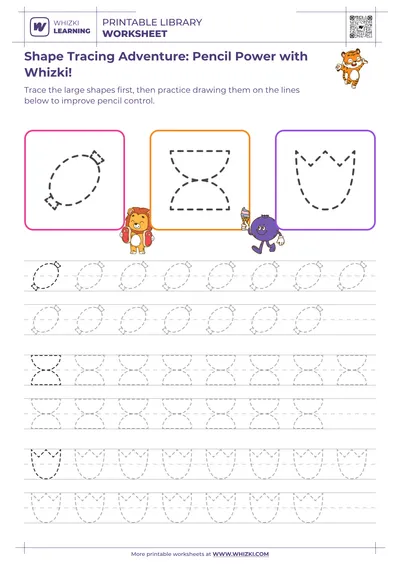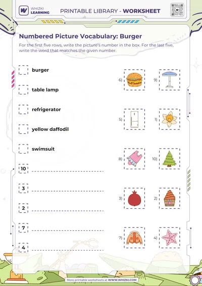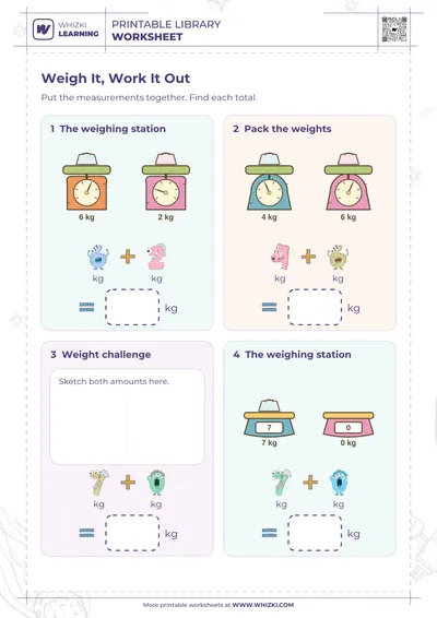

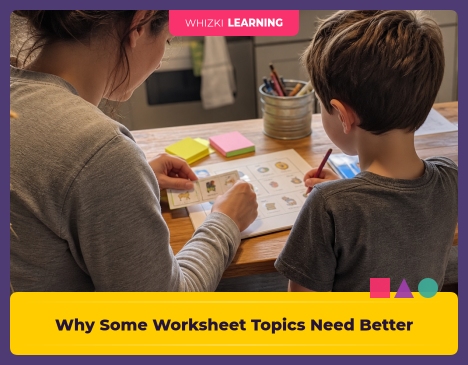
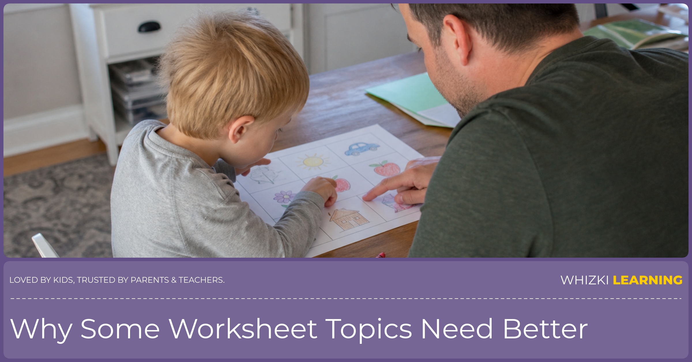
If your child stalls on a worksheet because the community helper, map, holiday picture, sorting item, or graph box looks confusing, cover the caption for thirty seconds and ask, “What do you see first?” The small pause keeps the moment from turning into another round of adult explaining. The answer tells you whether the worksheet problem is the skill or the picture clarity before you add more directions.
Reviewed by Whizki Editorial Team, Early Childhood Education Editors.
May audit field note
The May worksheet audit flagged gaps in community helpers, maps and geography, holidays and culture, matching and sorting, and one measurement-and-data cell. The documented fact is narrow on purpose: the audit found places where the artwork was doing too little of the task for children ages 3 to 7. Reggio practice treats children’s observations as useful evidence, so the review looked first at what a child could notice before an adult read the words.
The worksheet art mattered because young children often read the picture before the sentence. A firefighter without clear gear, a map without recognizable land and water, or a holiday scene that assumes one family tradition can make a simple prompt feel like a guessing game. NAEYC guidance keeps reminding early-childhood teachers to match materials to children’s lived experience, and clear images are part of that match.
The design choice after the May audit was not “add more labels everywhere.” The design choice was to decide where a cleaner drawing, a more inclusive scene, or a more familiar object would carry the task better than another line of text. That choice respects children who are still building language, fine-motor control, background knowledge, and print awareness at the same time.
Why pictures carry the task for ages 3 to 7
A worksheet for ages 3 to 7 often asks a child to hold several things in mind at once: the picture, the direction, the pencil movement, and the answer choice. The NAEYC idea of developmentally appropriate practice is helpful here because the worksheet should reduce unnecessary confusion, not test a child’s ability to decode a vague icon. Clear artwork gives the child a fair shot at showing the actual skill.
The occupational-therapy lens is practical: a child needs enough visual contrast, spacing, and figure-ground clarity to find the important part of the page. A sorting page with tiny objects crowded together can turn into a visual search chore. A matching page with similar-looking items can ask for more visual discrimination than the learning goal actually needs.
The Orton-Gillingham habit of making the target obvious also applies outside letter work. When a phonics lesson isolates one sound, the teacher removes distractions so the child can attend to the sound. When a geography or community-helper worksheet has one goal, the artwork should make the important feature easy to notice without adult translation.
Where the gap showed up
Community-helper pages need artwork that shows the tool, setting, and action in a way a preschooler can name. Speech-language pathology practice often starts with clear, familiar nouns and verbs because children need a stable picture before children can sort, describe, or answer. A helper drawing that depends on a tiny badge or a vague hat may be too weak for the task.
Maps and geography pages need land, water, roads, symbols, and simple perspective that match what a young child has seen in books, walks, classrooms, or car rides. Montessori and Reggio classrooms both lean on concrete experience before symbols, so a map worksheet should not jump straight to abstract icons without a recognizable anchor. Holidays and culture pages need the same care because inclusive artwork shows real variation without turning one tradition into the default answer.
Matching and sorting pages need pictures that share one intended feature while avoiding accidental clues. An occupational-therapy heuristic I use is to check whether the child can scan the row without squinting, rotating the paper, or asking what an object is supposed to be. The measurement-and-data cell from the audit needed the same review because a graph box, tally picture, or measuring item can fail when the image is too small or the category is unclear.
Try a ten-minute clarity check
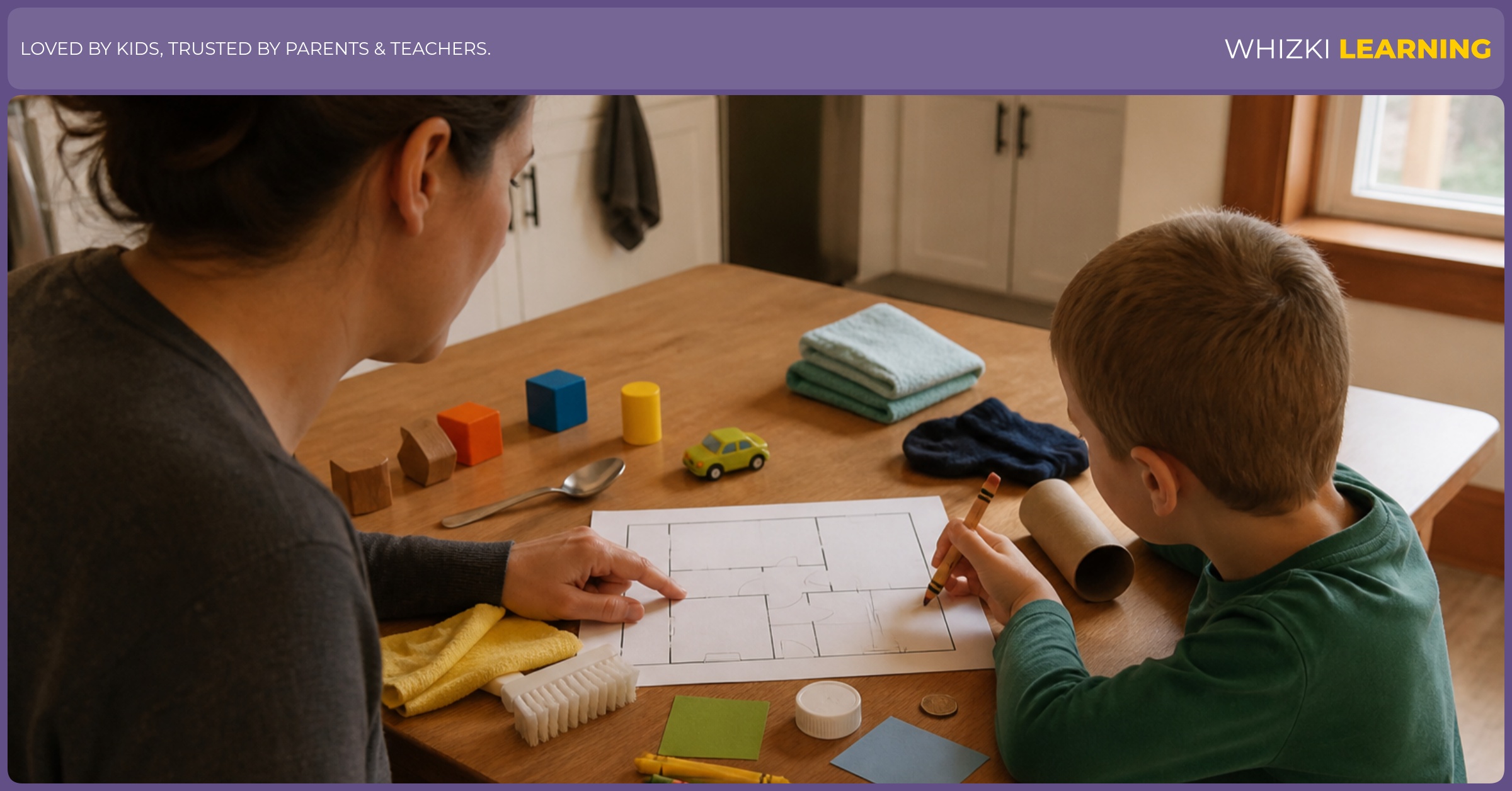
A proposed check for home, preschool, kindergarten, or homeschool takes about ten minutes and needs one worksheet, two sticky notes, a crayon, and three small household objects. The adult does not need to reteach the whole page during the check. NAEYC-style observation helps here because the adult watches what the child notices before judging the child’s answer.
First, cover the printed direction and ask the child to name three pictures on the page. Next, uncover the direction and ask the child to point before using a crayon, since pointing lowers the fine-motor demand. Last, place a real object beside one confusing drawing, such as a spoon beside a drawn spoon or a toy car beside a map road, and see whether the picture becomes easier to use.
The age adjustment is simple: a 3- or 4-year-old can point, name, and sort with an adult nearby, while a 5- to 7-year-old can explain what made the picture easy or hard. The honest limit is just as important: a worksheet cannot replace conversation, play, field trips, block maps, or shared books. The clarity check only tells you whether the picture is helping the task or getting in the way.
For low-pressure comparison pages, the printable library gathers early learning printables that parents and teachers can preview before using. Choose one page, do the ten-minute clarity check, and skip any page that needs too much adult translation that day.
How we decide redraw or rewrite
The review question after the May audit was, “Would a better picture solve the child’s confusion, or does the task itself need new words?” The Orton-Gillingham approach gives a useful habit here because the teacher separates the target skill from the noise around the target skill. The same thinking guided the previous field notes guide, where the review process looked at what families could actually use next.
A redraw is usually better when the child understands the direction but cannot identify the picture. A rewrite is usually better when the picture is clear but the task asks too much at once. A page needs both changes when the artwork, direction, and answer format all compete for the child’s attention.
The review method stays small because early-childhood materials should be tested against real use, not ideal use. A parent at the table, a teacher with twelve children waiting, or a homeschooler between snack and cleanup needs the page to communicate quickly. Clear, inclusive, recognizable art is one way to make the worksheet fair without pretending the worksheet is the whole lesson.
The best worksheet art for ages 3 to 7 is quiet, specific, and fair to the child’s life. Better artwork will not turn a worksheet into a full lesson, but better artwork can keep the picture from becoming the hidden puzzle.